You are using an out of date browser. It may not display this or other websites correctly.
You should upgrade or use an alternative browser.
You should upgrade or use an alternative browser.
Naruto Forum Signature // Rate /10
- Thread starter Zahreah
- Start date
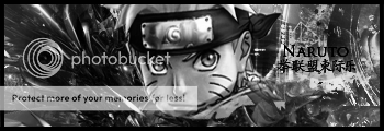
You don't seem to realize. The idea IS to have to colors like that. If i left them normal it would be like a fu*king rainbow xD.
I Had to use like 4 color balances and hue+saturation just to achieve that affect so not really simple is it?
The placement. If the render gets placed anywhere else. All you see to the left it a couple c4d renders. a flare and a few smudged layers. Placing it in the middle draws attention to the render which is what was needed. Not people to stare at whats happening behind.
Text placement. I Agree with that.
And the border? It depends what you fall down on.As far as i can tell. You use a very tiny border which nobody sees and it serves no purpose. Some people i have worked with through Graphics Design used the idea on using a slightly thicker border which draw all attention to the image.
Thats what it should do.
Anyway. Your opinion on this is well. Your opinion. I'm just justifying your points.
Acquiescences said:You don't seem to realize. The idea IS to have to colors like that. If i left them normal it would be like a fu*king rainbow xD.
I Had to use like 4 color balances and hue+saturation just to achieve that affect so not really simple is it?
The placement. If the render gets placed anywhere else. All you see to the left it a couple c4d renders. a flare and a few smudged layers. Placing it in the middle draws attention to the render which is what was needed. Not people to stare at whats happening behind.
Text placement. I Agree with that.
And the border? It depends what you fall down on.As far as i can tell. You use a very tiny border which nobody sees and it serves no purpose. Some people i have worked with through Graphics Design used the idea on using a slightly thicker border which draw all attention to the image.
Thats what it should do.
Anyway. Your opinion on this is well. Your opinion. I'm just justifying your points.
Why did you use all those settings to get Black and White, when you could just use a simple fill layer?
Every single good GFX artist knows that placing the render in the middle is always a bad thing.
Thats quite wrong as most GFX artists that have been doing GFX alot and long dont even use a Border. So making it thicker is pointless for them.
Its your opinion all the same.. I was just pointing out the mistakes in what you wrote.
Lol.
I Tried that. but it didnt look how i wanted it to look.
You're not a good GFX artist if you stick to what everybody else does and dont be yourself or 'original'
Also. by GFX designers. i dont mean people on the internet who make Signatures for people.
Anyway.
Fuck this.
I Tried that. but it didnt look how i wanted it to look.
You're not a good GFX artist if you stick to what everybody else does and dont be yourself or 'original'
Also. by GFX designers. i dont mean people on the internet who make Signatures for people.
Anyway.
Fuck this.